This page is intended to supplement the findings dicussed as part of the Open Age session held online on 29th March 2022. All of the maps featured here can be clicked on and explored in more detail, particularly in relation to local areas of interest. Only data for North West London are represented here, but similar analyses can be conducted for any other part of England.
Lots of the data used for these analyses are publicly available, and links to the relevant data sources used are included at the end of the page. If you have any further questions about the methods used or the findings, please do get in touch with me over email.
This page begins with an exploration of how potential healthcare need may vary across North West London and how this relates to important outcomes like life expectancy.
Slides from the talk can be found here
London is special. It is by far the largest city in the UK with a resident population of 9 million people, rising to over 14 million people if you include the wider London metropolitan area. It is an area with tremendous diversity with respect to age, ethnicity and economic circumstances.
How is North West London different from elsewhere in London? Perhaps the biggest different from the perspective of how health systems operate is the abundance of hospital sites within the region. Unlike elsewhere in London, many of the hospital trusts in North West London are spread across multiple sites. Some of these sites provide complementary services, while others provide the same services. Take the largest hospital trust in the area, Imperial College Healthcare NHS Trust, which includes four different hospital sites as well as providing services at several other community hospitals and other acute hospital sites in the region.
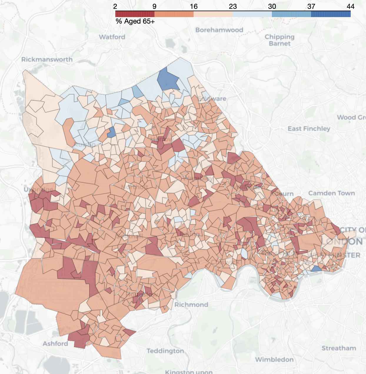
The maps below show how factors including life expectancy and overall socioeconomic deprivation vary across North West London. Clicking on each map will take you to an interactive version to explore where you live in more detail.
Percentage of the population aged 65 years or more across North West London
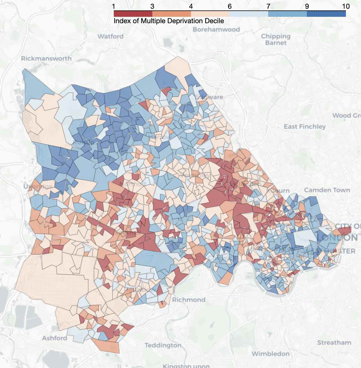
Index of Multiple Deprivation deciles across North West London (1 = most deprived, 10 = least deprived)
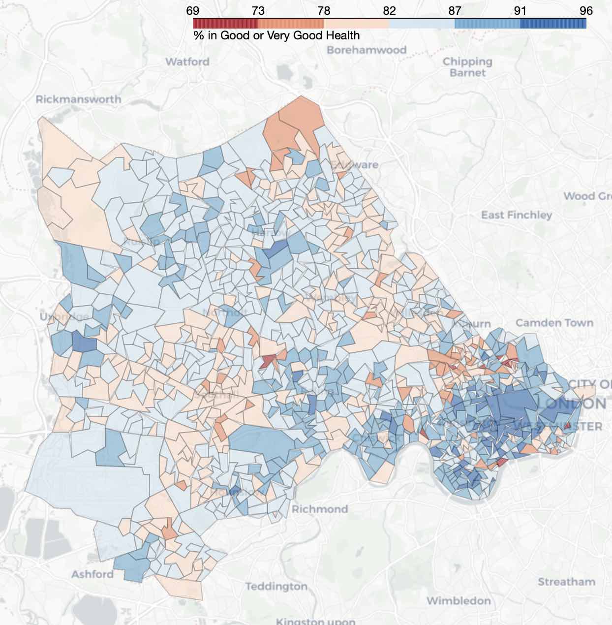
Percentage of the population rating their health as 'good' or 'very good' across North West London
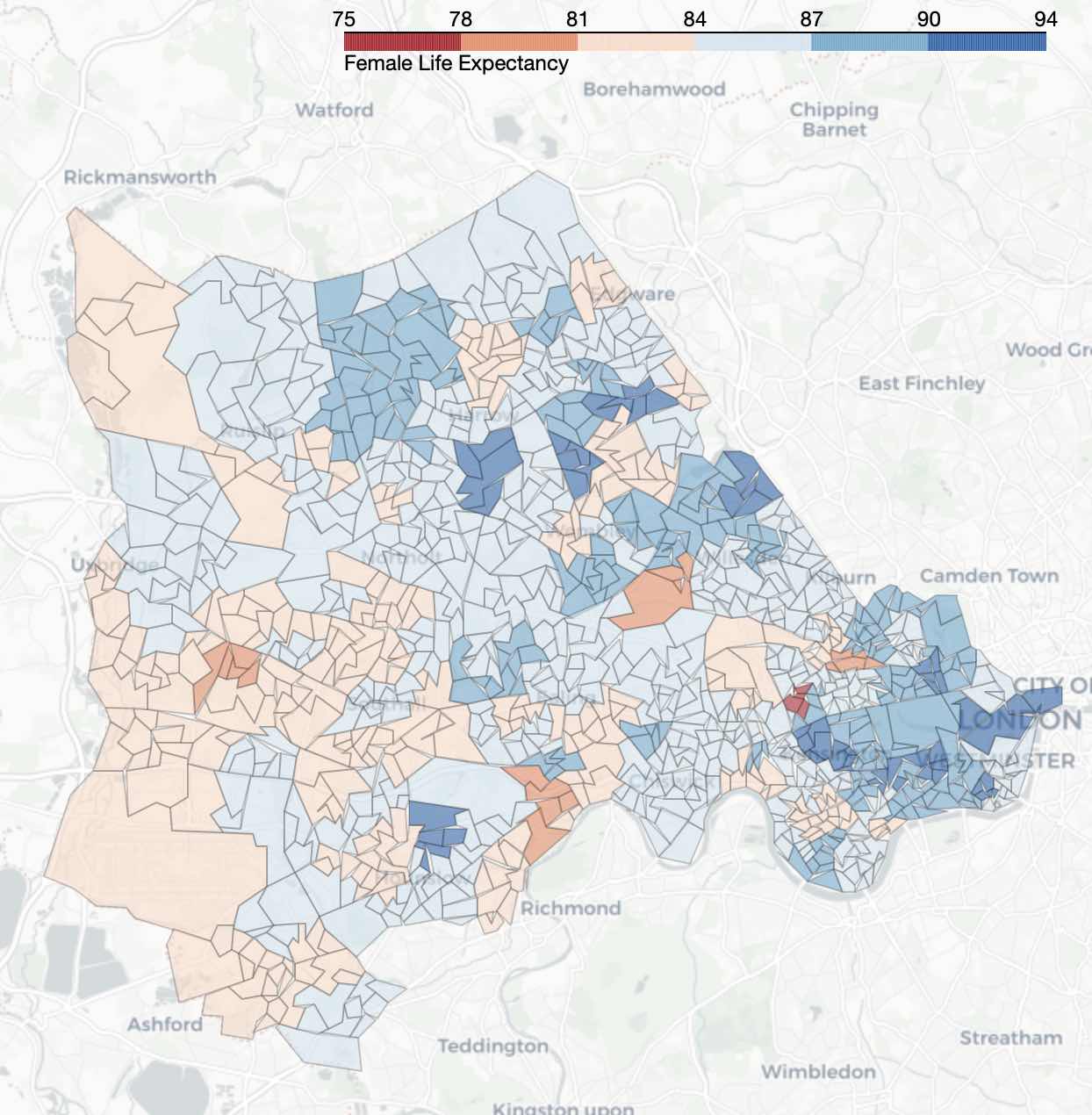
Female life expectancy at birth in years across North West London
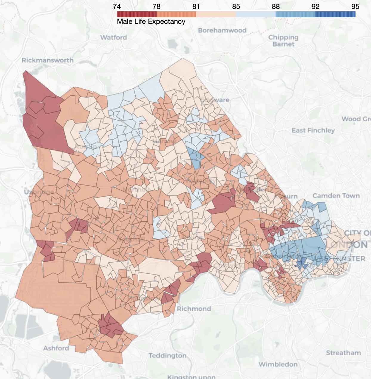
Male life expectancy at birth in years across North West London